Products mentioned in this guide
Start here if you already know what problem you want to solve. These text-only cards use tagged Amazon links and do not reproduce Amazon product images or prices. Review the fit notes, then verify the current listing on Amazon.
Listing checked · Aug 14, 2026
Zebra Pen MILDLINER Dual Tip Highlighter, Assorted Colors, 15-Pack
Zebra Pen · Japanese Brand
Adds visual hierarchy to notes without making every marked passage equally loud.
- Why consider it
- Fifteen mild colors and broad/fine tips support highlighting, underlining, labels, and small annotations.
- Best for
- Students, planners, and analog note-takers who use color as a limited navigation system.
- Check first
- Test every color on the actual paper first. Bleed-through, show-through, feathering, and drying behavior vary by paper and ink load.
- Origin
- Japanese Brand; manufacturing country is unverified.
- At last check
- Ships from Amazon.com · Sold by Amazon.com
Paid Amazon link. Price, availability, seller, shipping party, and product details can change. Verify the current listing before ordering.
Highlighting should make the next visit faster
Color is useful when it helps you find, compare, or act. If half the page is highlighted, the color no longer creates hierarchy. Mild tones can reduce visual competition, but the system still needs rules.
Create a three-color grammar
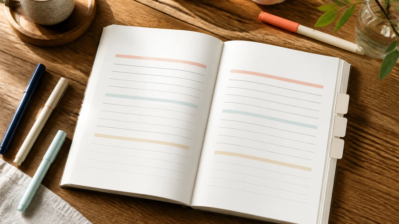
Begin with three roles: one color for the main idea, one for evidence or definitions, and one for actions or questions. Write the key on the inside cover until the meaning becomes automatic.
Do not assign a separate color to every subject. The same functional grammar across classes or projects makes pages easier to scan later.
Give the broad and fine tips different jobs
Use the broad tip for short phrases after the text is written. Use the fine tip for an underline, margin symbol, label, or connector. Separating jobs keeps the broad tip from filling every available space.
Run a paper-and-ink test first
On a back page, test one quick stroke, one slow stroke, and a second layer after drying. Check the reverse for bleed-through and show-through, then check the front for feathering and smearing over your usual pen ink.
Thin planner or Bible paper can behave differently from notebook paper. “No Bleed” in a product title is not a universal guarantee.
Common highlighting mistakes
Most problems come from using color before deciding what matters.
- Highlighting during the first read before understanding the structure.
- Using color for decoration and meaning at the same time.
- Choosing too many similar categories.
- Layering before pen or marker ink is dry.
- Depending on color alone instead of headings, symbols, or words.
A practical note-organization checklist
Review the system after one week.
- Three or fewer functional colors to start.
- A written key with plain-language meanings.
- Broad tip for phrases; fine tip for marks and labels.
- Paper and pen compatibility tested.
- Important information still identifiable in grayscale.
- Unused colors remain optional, not obligations.
Use less color with more consistency
A mild palette works best when the rules are strong and the marks are selective. Highlight for the future reader—yourself returning to the page—not for the finished-page photograph.
How we choose what to consider
Criterion 1
Every color has one repeatable role.
Criterion 2
The system works in grayscale and without color.
Criterion 3
Ink is tested on the actual paper and writing pen.
Criterion 4
Broad and fine tips are assigned different jobs.
Who this is for—and what to watch
Good fit for
- Students revising from paper notes
- Planner users building a small color key
- Readers who find neon pages distracting
Watch for
- Universal no-bleed claims
- Highlighting wet pen ink
- Color systems with too many categories
Related guides
 Kitchen
 How to Evaluate Japanese Kitchen Tools Before Buying Online
A verification-first guide to dimensions, materials, care, origin claims, and seller details for US kitchens.
Read the guide Storage
 8 Japanese Storage Ideas for Small Apartments
Use routines, gaps, and vertical surfaces carefully—plus two verified, image-free product examples with honest fit checks.
Read the guide Cleaning
 How to Choose Japanese Cleaning Tools for Different Surfaces
Choose by surface, soil, stiffness, and care—not by novelty or an unsupported “scratch-free” promise.
Read the guide